Ultimate inspiration for mobile site design
Posted 09th October, 2019 by Sarah
6 minute read
Today, there’s no excuse for not optimising the websites you design for mobile. Phones accounted for more than 50 per cent of all organic search visits in the first quarter of 2019, according to the Digital Marketing Report.
Of course, there are websites that are optimised for mobile and there are websites that are built for mobile first.
In this article, we’ll look briefly at what a best in class mobile site is made of before looking at a few examples of sites that really knock the ball out of the park.
11 ingredients of a top mobile site
The best mobile sites will feature the following…
• Content that’s not just sized correctly for the viewing pane, but has an aesthetic appeal on screen, too
• Tap targets that are perfectly poised
• Fonts that are not just legible, but impactful
• Well-thought-out colour contrasts
• A perceptual speed index below 1,300 milliseconds
• A load time of fewer than 100 milliseconds
• A CDN for all static assets
• Progressive JPEGs
• A brand logo that’s linked to the homepage
• Options that allow users to share the site
• A layout that doesn’t shift when media loads
6 examples of cracking mobile sites
Christian Coan – how to do impactful
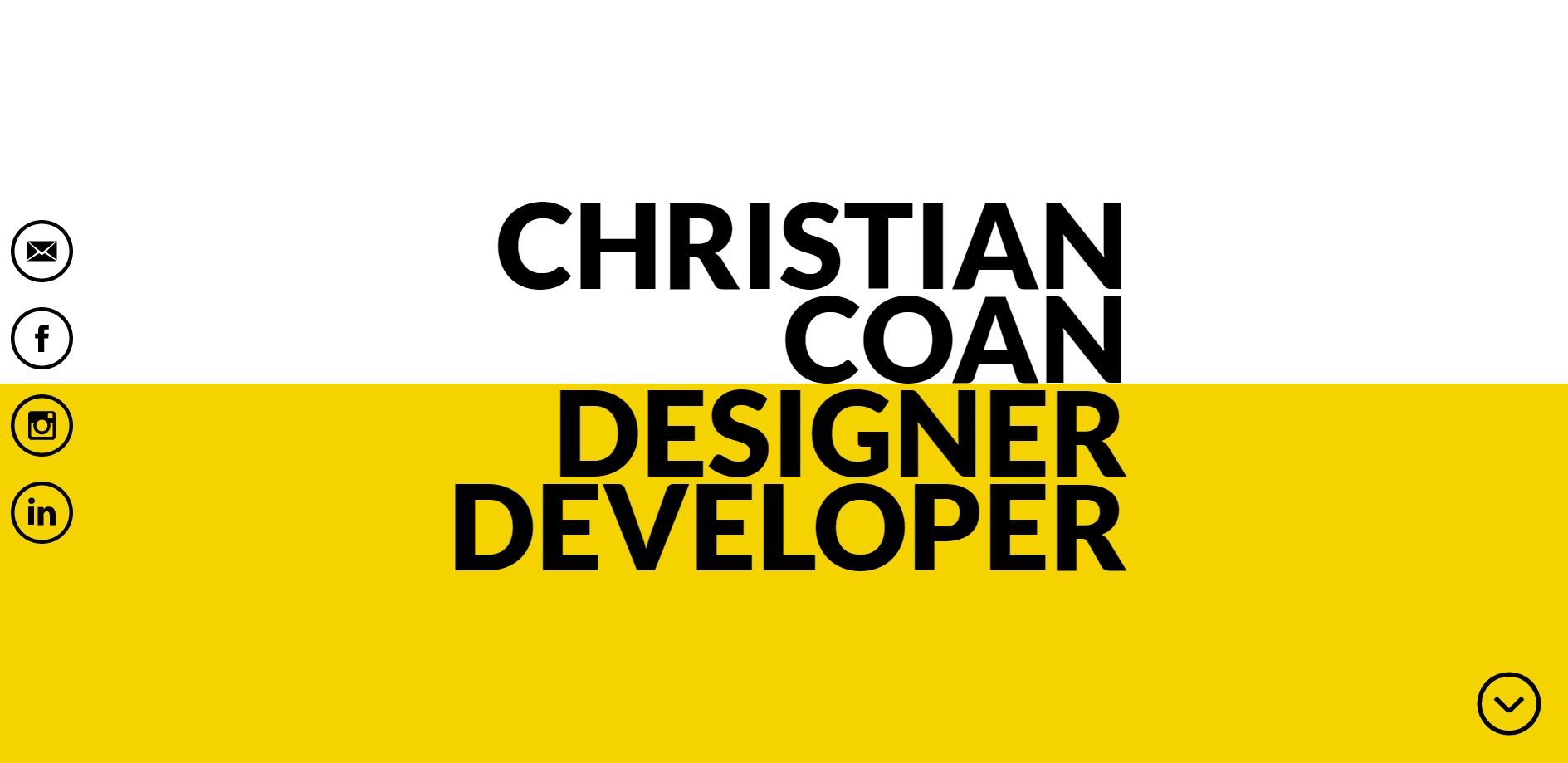
The homepage of this site is simple. It features Christian Coan’s name followed by his job description ‘designer developer’. However, it’s the colours that you’ll notice before you read the words on the site.
Coan uses two stark colour contrasts to pack a punch with his site from the get-go. His name is written in black type on a white background and his job title is written in black type on a yellow background – giving it a colour contrast of 19.56:1.
Another great thing about this site is its subtle theatrical element. When users scroll down on the mobile version of the site, the two parts of Christian Coan’s name fly apart like stage curtains.
The rest of the site is pretty simple. There’s a short showcase of Coan’s work before a set of very clear links to social media sites and email.
Martin Ehrlich – how to do emotive
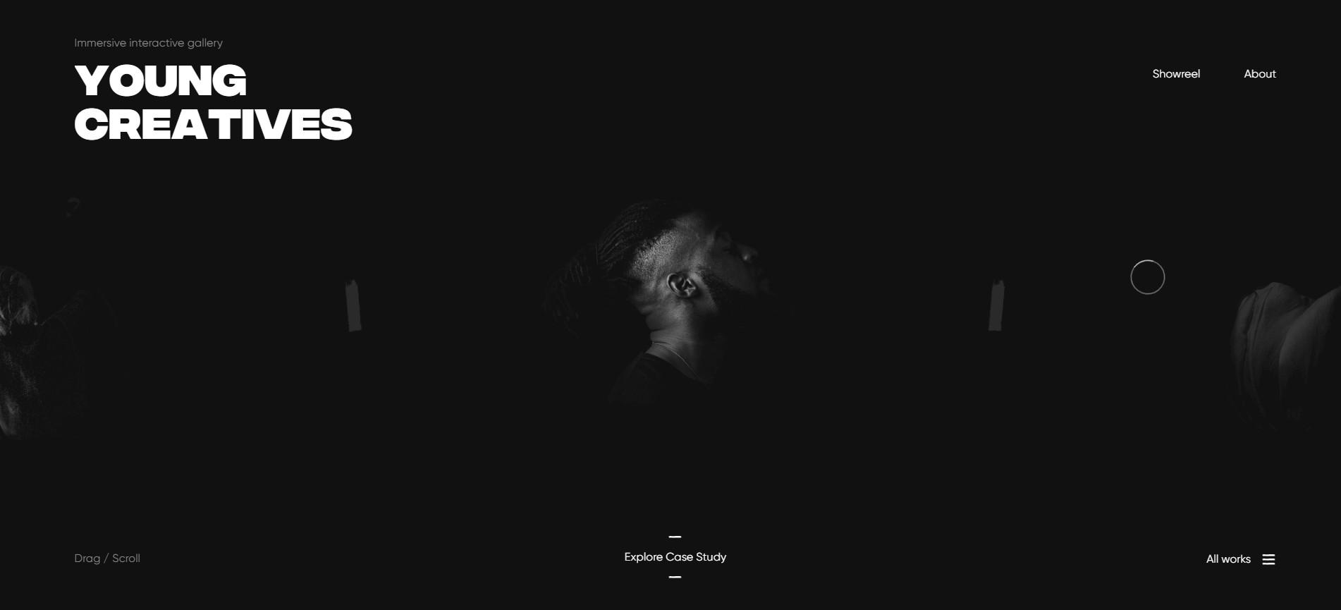
While Martin Erhlich’s website ticks all the above boxes in terms of mobile friendliness, performance, usability and progressive web app best practice, it’s the swank of this site that makes it most memorable.
Martin Ehrlich is a UX designer in addition to a digital art director and it shows. His website features the most contemporary web design practices – from utilising a black and white colour scheme to including kaleidoscope photo effects. It also features a video showreel that loads in the blink of an eye. It’s no wonder this designer has a string of awards to his name.
Finding CTRL – how to do contemporary
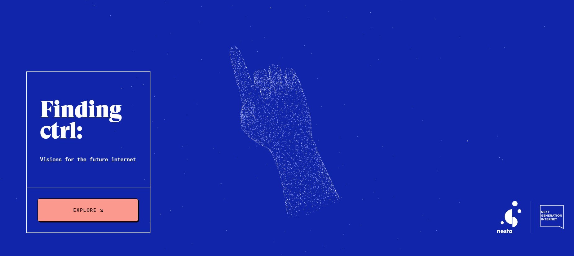
Finding CTRL has been created as part of the EU’s Next Generation Internet Initiative and is designed to help people explore visions for the future of the Internet.
While the site’s above-the-fold section is designed in the harmonious colours of midnight blue and skin pink, the rest of the site features a contrasting colour design featuring white on blue and blue on white. Fonts are bold and the user’s attention is maintained through the use of strategically placed images and illustrations that load instantly.
Just like Martin Ehrlich, the designers of this site have their finger on the web design pulse. The site features a number of absorbing cinemographs.
FoodHallen – how to do effortless
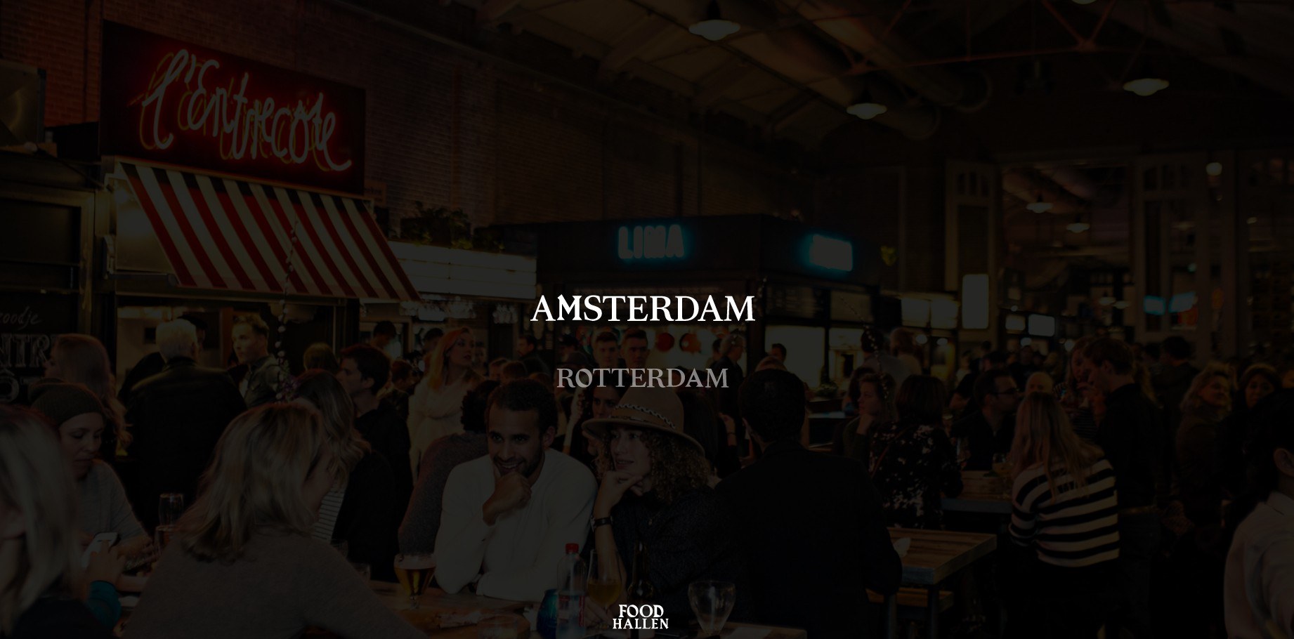
This chain of food halls located in the Netherlands has a website that’s ultra-responsive. In fact, it feels slightly precognisant at times.
For example, when you enter the site, you select the food hall destination you want to find out more about from a simple menu written in striking fonts.
Once you’ve selected your venue, the words Welcome to Our ‘Amsterdam’ Venue appear and just before you go to scroll beyond them, they disappear by themselves and a full-screen image appears of the hall. You can scroll on from there.
Most of the text on the sight is in full contrast white on black and colour is added by a series of real-life photographs.
Armat Vodka – how to do slick

The site for this vodka company hits the nail on the head as far as mobile friendliness is concerned. The content fits artfully into the screen, the tap targets are responsive and the contrasting colours of blue on white, red on white and green on white make it easy on the eye.
What’s most striking about this site, though, is its interactivity. On the homepage, users don’t scroll they swish. They swipe a bottle of vodka to the side of the screen and it circles away to be replaced by a different type of bottle.
For when users get sick of the novelty and want more information, the menu button is clearly visible in the right-hand corner of the site. Clicking on this takes users to an immaculately designed ‘about us’ page where a mountain scene fills the entire area above-the-fold. Users can scroll from here.
Feral – how to do stylish
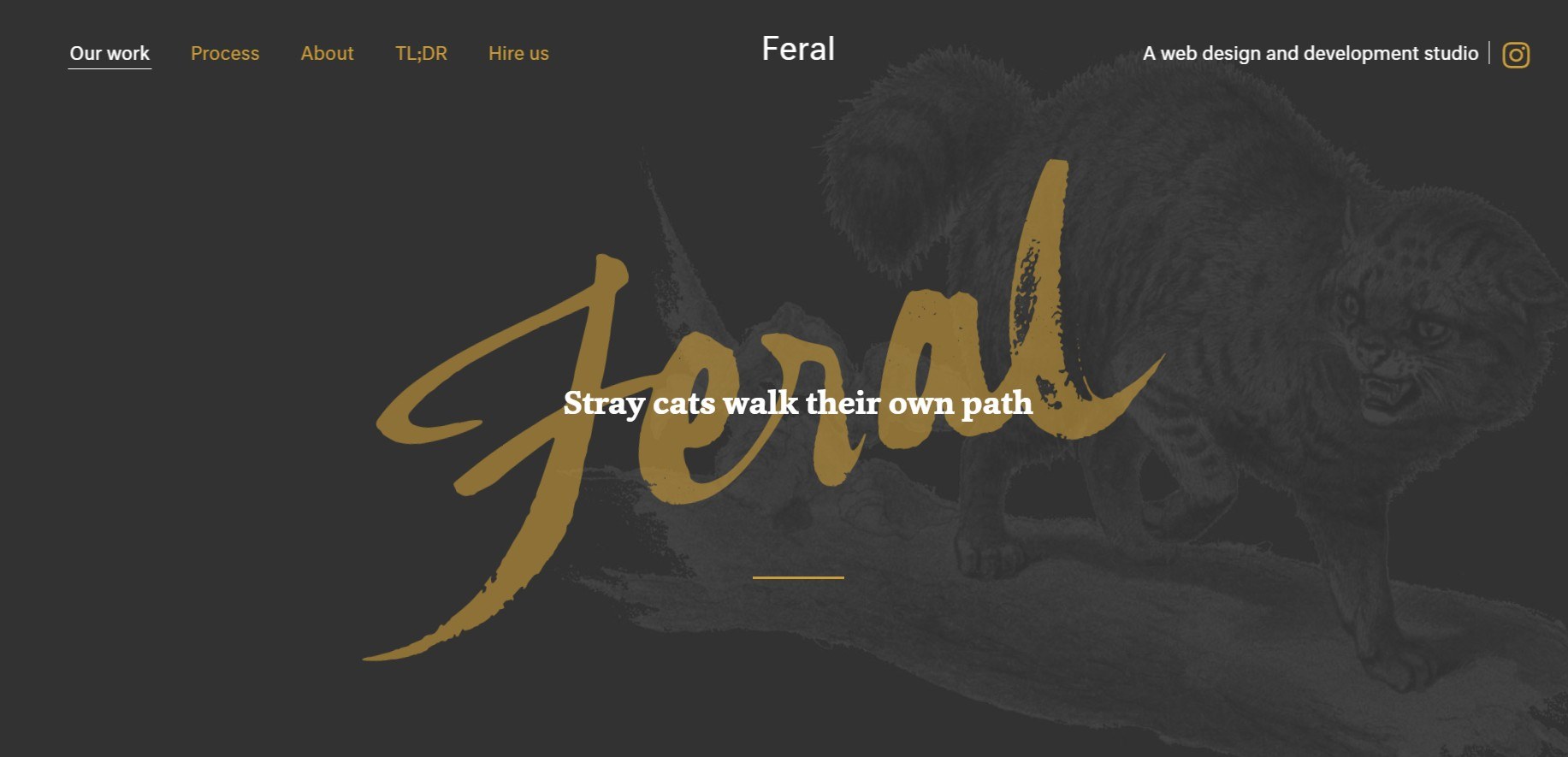
The mobile site of this PR company is a joy to scroll through. It segments information into neat and tidy square or rectangular sections.
It also uses font changes to keep users flowing through the site. All text is black on white, but subtle font changes – such as alterations in boldness and font size – make users feel like they’re journeying through the website instead of merely trawling.
Categories: Web Design